Bugeye
Well-Known Member
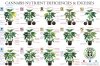
Something wrong with your plant and you are trying to use a chart with pictures of leaves to diagnose? Still can't figure it out?
A nutrient deficiency can be produced in two basic ways, not enough nutrient in your medium or feeding, or a nutrient lock out. A lock out can be from wrong ph, mixing multi-part nutes incorrectly, or from nutrient antagonism.
Most people know about ph lock out, or learn about it quickly. Nutrient antagonism is where things get complicated. If this is a new term for you, google it or "mulders chart" and view images. You will see images or charts that show how too much or too little of one nutrient can affect other nutrients.
Back to my original question, having trouble finding a pic of your leaves on those diagnosis charts? The reason is that you rarely miss the optimal feed with just one nutrient, if you are over or under feeding a balanced diet, you will be deficient on more than one nutrient most times. This renders much of those diagnosis charts useless. Mulders chart is complicated enough with just one nutrient off, imagine the complexity if multiple things are off.
Instead of focusing on which particular nutrient you are deficient on, it is good to first examine if your feeding program is a good balance for the plant at whatever stage in the life cycle you are in. Opinions vary on what the optimal nutrient ratios are, but if you are feeding 0-50-3 to your seedlings, it will be obvious you are off. If you believe your nutes are balanced to plant needs, then next focus on determining if you are over feeding or under feeding.
Hope this helps you, it all gets easier with experience!